
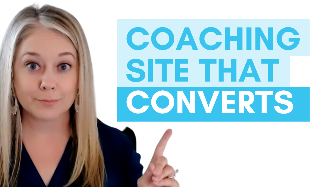
Coaching Website Design: One Page Layout That Gets CLIENTS
Click on the image to play the YouTube video. Or, continue reading as a blog below!
What website design gets clients?
Before you spend months building out a multiple page website for your coaching business, read this blog or watch this video. I'm going to show you a real life example of what a clean strategic one page website looks like, plus why the simple layout is often all you need to start booking clients.
Why One Page Works
A lot of coaches think they need a blog, an about page, a services page, a contact page. But when you're just getting started, all of those extras can slow you down and keep you from pitching to clients. A single well-designed page can do it all: explain what you do, who you help, how you help them, share about you, provide social proof, and show how to get in touch.
Hero Section
The most important part of the top of your site is a clear statement that instantly tells visitors what you do in their words. For coaches, I call this your coaching outcome statement. This quickly communicates the transformation you help people achieve.
Who It’s For
This section speaks directly to the struggles of your ideal client. Use a short paragraph or bulleted list of pain points so they can immediately identify with what’s written.
How You Help
Right after the pain points, flip the script and highlight the transformation. Use a paragraph or list that reflects the opposite of what they’re stuck in—so it feels like hope and possibility.
About Section
Keep this short and intentional. It's not your life story, but a relevant intro that helps the reader trust you and feel a connection. Make it about them, not just you.
Testimonials
If you have them, showcase results here. If you don’t yet, that’s okay—your website is a living, evolving thing, and testimonials can be added later.
Calls to Action
Your call to action should be simple, clear, and repeated multiple times across the page. This keeps it obvious what step you want visitors to take next.
Contact Section
Include a simple way for people to reach out. It’s a low-pressure option that makes it easy for potential clients to connect.
Client Example
Here’s what one client shared after launching fast with this one-page layout:
“Your process was really helpful for my brain. Even if I fell a little behind, I could easily jump back in and get the next task. Nikki was so helpful—proactive but not pushy. It’s validating and legitimizing; this business is legit and ready to go.”
-Tara Hastings
What’s Next?
In the next video, I’ll walk you through what you really need (and don’t) to launch your website so you can move forward without waiting for perfection.
Want to Launch Faster? Here’s Your Next Step…
If you want more practical tips to help you launch your coaching website faster, be sure to grab my free guide:
Three Mistakes to Avoid Before Launching Your Coaching Website

Sign up below to learn how to get your site launched faster!